


You pour a whole weekend into a video, hit publish, refresh YouTube Studio… and your click‑through rate is sitting at 2.3%. Painful. The content might be great, but if the thumbnail doesn’t win the first glance, almost nobody will ever find out.
When people search for good YouTube thumbnails, what they really want is simple: a repeatable way to turn ideas into thumbnails that pull clicks without misleading viewers or burning their audience’s trust.
In this guide, we’ll walk through seven design principles backed by real CTR ranges from creators and analytics tools, plus a practical workflow you can reuse for every upload. No art degree needed; just a bit of structure and a willingness to iterate.
TL;DR: What makes a good YouTube thumbnail?
Short version: good thumbnails win attention in half a second and match the story your video actually tells.
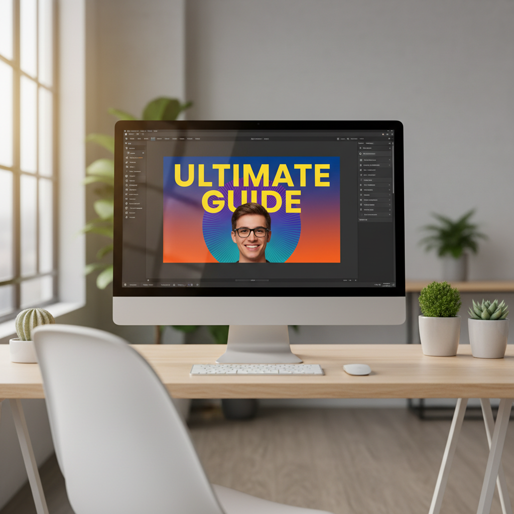
A clean thumbnail layout with one clear idea, big text, and high contrast is easier to understand at a glance.
- One clear idea: one scene, one subject, one emotional message.
- Big, simple text: 2–5 words that still read on a phone screen.
- Strong contrast: bold colors and light/dark contrast so the subject pops from the background.
- Faces or a clear focal point: expressive human faces or one strong object, never a crowded collage. (Backed up by the VidIQ guide on YouTube thumbnail design tips.)
- Title + thumbnail combo: they work together; the thumbnail teases, the title explains.
- Consistent style: fonts, colors, and layouts that viewers recognize across your channel. (See the InstantViews article on YouTube thumbnail best practices.)
- Data‑driven iteration: you regularly test variations and keep what lifts CTR, even if only by 0.5–1 percentage point. (As shown in the Unkoa case study on thumbnail design and testing.)
Why thumbnails and CTR matter more than you think
Your thumbnail is the first promise you make to a viewer. YouTube counts an impression every time that little rectangle appears on Home, search, or suggested feeds. CTR (click‑through rate) is simply:
CTR = clicks ÷ impressions × 100
Across many niches, a “solid” impression CTR often lands somewhere between 2–10%, with smaller, highly focused channels sometimes sitting higher and broad‑reach channels often lower. Rather than chasing a magic number, track how your own thumbnails trend over time.
You can check all this inside YouTube Studio → Analytics → Reach, which breaks down impressions and CTR by traffic source. External calculators like the YouTube CTR Calculator from CTR-Calculator are handy if you want a quick gut‑check.
The punchline: good thumbnails are not decoration. They are levers for impressions, CTR, and watch time — the three signals YouTube leans on when deciding whether to keep showing your video.
7 design principles of good thumbnails (backed by CTR data)
1. Clarity beats cleverness: one idea per thumbnail
Scroll through your own subscriptions and notice what you actually click. It’s usually the thumbnail that tells one simple story: “I fixed this”, “I broke that”, “This number changed”. Good thumbnails for small channels lean even harder on clarity, because you don’t have a huge fanbase to decode inside jokes.
A practical rule: if a 12‑year‑old can’t explain what the thumbnail is about in half a second, it’s probably too busy.
2. Big, bold text that survives on mobile
Most views now come from phones, where your thumbnail is barely bigger than a postage stamp. Designers who work with mid‑sized channels often cap thumbnail text at 2–5 words and use heavy, clean fonts (Bebas Neue, Montserrat Bold, etc.) with a clear outline. For more examples, see the InstantViews breakdown of YouTube thumbnail text best practices.
Quick test: shrink your design to roughly 320 × 180 pixels. If you can’t read it at that size, your audience can’t either. This is especially true for “how to” content where viewers are searching fast and scanning many results.
3. Faces and emotion, or one strong focal point

Expressive faces and clear emotions often help YouTube thumbnails stand out and attract clicks.
Human faces with clear emotion tend to lift CTR compared with flat, abstract designs. Multiple studies from creator‑tools and agencies report 20–40% lifts when channels moved from generic screenshots to close‑up, expressive faces with simple text.
No face in your niche? Use a single strong focal point instead: a key product, a graph with a dramatic spike, or a bold symbol. Either way, you’re giving the eye one thing to land on, not a cluttered collage.
4. High contrast and color that stands out from YouTube’s UI
YouTube’s interface is full of reds, whites, and dark grays. Thumbnails that use the same palette tend to blend into the background. Many high‑CTR channels use strong color blocking (for example, yellow or teal against dark blue) and clear light–dark contrast to help their subject jump off the feed.
A simple trick: limit yourself to 2–3 main colors and make sure your subject and text sit on the opposite end of the contrast spectrum from the background. If everything shouts at once, nothing stands out.
5. Title–thumbnail combo, not duplicates
Many thumbnails simply repeat the exact title text. That wastes real estate. In most high‑performing examples, the title tells the full story (“How I went from 0–100k subscribers in 6 months”), while the thumbnail picks one sharp hook (“6 MONTHS” or “100K”) plus a strong facial expression or visual metaphor.
Think of it this way: the title is the sentence; the thumbnail is the punchline. Together they answer “Why should I care?” and “Why should I click you instead of the nine other videos in this row?”
6. Consistent templates with small experiments
Viewers build pattern recognition fast. When your fonts, colors, and layouts are consistent across uploads, people can spot your content without even reading the channel name. Many larger channels use 2–4 thumbnail “templates” and swap out just the image, text, and color accent each week.
This helps in two ways: new viewers get a sense of your brand, and you can run cleaner experiments (“same layout, different text” instead of “everything changed at once”).
7. Test, don’t guess (and use YouTube’s own tools)
Instead of arguing in Discord about which thumbnail looks better, let data decide. Case studies from creator‑focused blogs show that systematic A/B testing of thumbnails can lift CTR by 10–20% over time; one example comes from the Unkoa guide to YouTube thumbnail design tips.
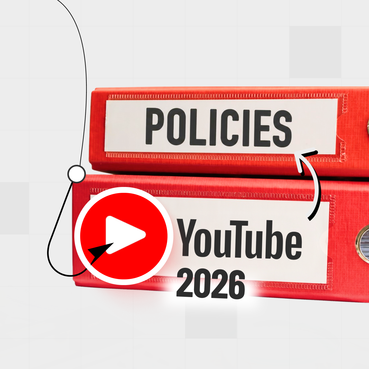
YouTube has been rolling out native title‑and‑thumbnail experiments in YouTube Studio, letting you test multiple versions on the same video and keep the winner automatically, as covered in The Verge’s overview of YouTube’s A/B testing feature for titles and thumbnails. When that’s not available yet on your channel, you can still swap thumbnails after a few hours, take note of CTR shifts, and build your own small dataset.
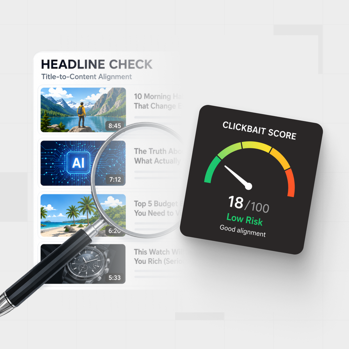
If you want to check whether those winning thumbnails still match what’s actually inside the video, you can run the URL through IsThisClickbait to see how honest the promise feels versus the content.
A simple thumbnail workflow you can reuse every week
Here’s a lightweight process you can follow, even if you’re a one‑person show editing on a laptop at midnight.

Sketching thumbnail ideas and checking analytics helps you turn “good YouTube thumbnails” into a repeatable workflow.
- Write the working title first. Get clear on the video’s core promise. If you need help staying honest with hooks, our clickbait examples guide breaks down a few patterns.
- Sketch three thumbnail concepts on paper. One face‑driven, one object‑driven, one text‑driven. Pick the one that tells the promise fastest.
- Design one “simple” version before adding extras. Start with background, main subject, and text. Only then add subtle details like arrows or circles if they truly help the story.
- Run the phone test. Export, airdrop it to your phone, and check it beside other videos in a playlist. If it looks muddy, fix contrast or text size.
- Publish, then iterate. After 24–48 hours, look at CTR and watch time. If CTR is low but watch time is fine, try a new thumbnail first. If CTR is high but people bail early, the promise and content might be misaligned — that’s where a tool like IsThisClickbait’s honesty score can highlight the gap.
If you’re a student or researcher using YouTube for studying, you can even use our YouTube study-notes flow alongside this thumbnail system to keep both learning and publishing structured.
Good thumbnails without clickbait: keeping the promise honest
There’s a line between “good thumbnails” and thumbnails that feel like a bait‑and‑switch. Short‑term, both might raise CTR. Long‑term, misleading thumbnails tank audience trust, watch time, and the very metrics that pushed the video out in the first place.
Your thumbnail is the first promise you make to a viewer. Treat it like a contract, not a trick.
The best creators treat the thumbnail as a promise and the video as the delivery. Your goal is to package the most interesting true part of the story, not to Photoshop in drama that never happens—a point echoed in the Stumbnail guide to creating YouTube thumbnails that get clicks.
That’s exactly why we built IsThisClickbait in the first place: our browser extension pulls the transcript, scores how clickbaity the title and thumbnail feel versus the actual content, and gives you a “would I feel tricked?” gut‑check before your viewers ever do.
If you’re shipping multiple videos a week, you can keep things honest at scale by running your uploads or even competitor videos through our YouTube clickbait detector and sharing the summaries with your team in docs or tickets.
Ready to pressure‑test your own packaging? You can start analyzing on a lower plan and only upgrade to higher limits if it actually saves you time.
FAQ: common questions about good thumbnails
What is a “good” CTR for YouTube thumbnails?
There’s no single magic number, but many analyses put a healthy impression CTR somewhere in the 2–10% range for most channels, with some niches and small, focused audiences going higher; for example, see the Adsbot article on good YouTube impression CTR. The real benchmark is your own history: if your last five videos average 3.5% and the next one hits 5.2%, that’s a win.
Do I need fancy software to design good thumbnails?
No. Lots of growing channels use Canva, Figma, or even Keynote/PowerPoint. What matters most is whether the design follows the principles above: one idea, big text, strong contrast, and a clear focal point. As your channel grows, investing in a thumbnail designer or Photoshop workflow gives you more control, but it isn’t mandatory at the start.
How often should I change a thumbnail?
Many creators give a new video 24–72 hours, then tweak if CTR is underperforming compared with recent uploads. When you change a thumbnail, note the time and check CTR and views again after a day or two. Over time, you’ll spot patterns about what works for your audience.
What makes good thumbnails for beginners or small channels?
For small channels, simplicity and relevance do the heavy lifting. Start with tutorial‑style topics where viewers already have intent (“How to…”), pair them with clear, benefit‑driven titles, then use thumbnails that show a face plus the end result (before/after, number hit, problem solved). That combination gives YouTube’s system clear signals to work with.
Can AI help with thumbnail ideas?
AI tools can brainstorm concepts, generate rough layouts, or help you batch‑test text options. Just treat them as assistants, not autopilot. You still need to decide what feels on‑brand, ethical, and honest for your audience. The same goes for AI‑written titles: run them through something like IsThisClickbait to check whether the promise matches the actual video.
Key takeaways
- Lead with one clear visual idea and 2–5 words of bold, legible text.
- Design for mobile first by checking thumbnail readability and contrast at small sizes.
- Use faces or a strong focal point and keep your thumbnail style consistent across uploads.
- Treat every thumbnail as an honest promise that your video actually delivers.
- Review CTR in YouTube Studio and iterate with simple thumbnail A/B tests over time.
Next step: pair good thumbnails with honest videos
Great packaging gets the click. Honest, useful content keeps it. If you’d like a quick, low‑friction way to check whether your titles and thumbnails still match what’s inside the video, you can try our browser extension.