


You’re not here to trick anyone. You’ve seen wild headlines work and want the parts you can legitimately steal. This guide breaks down 20 clickbait-style website examples, shows the layout and wording moves behind them, and gives you a simple framework to reuse.

Strong headlines work best when they’re backed by layouts and analytics that prove the promise.
We’ll stay on the honest side of clickbait: curiosity, specificity, and proof, backed by layouts that make it easy for the right visitors to say “yes.”
TL;DR
- “Good” clickbait is about clear payoffs and honest curiosity, not shock for shock’s sake.
- Use the CSPP formula: Curiosity, Specificity, Payoff, Proof.
- The 20 examples below cover SaaS, content, ecommerce, and education pages, each with a quick breakdown.
- Pair strong headlines with layouts that show proof right next to the promise.
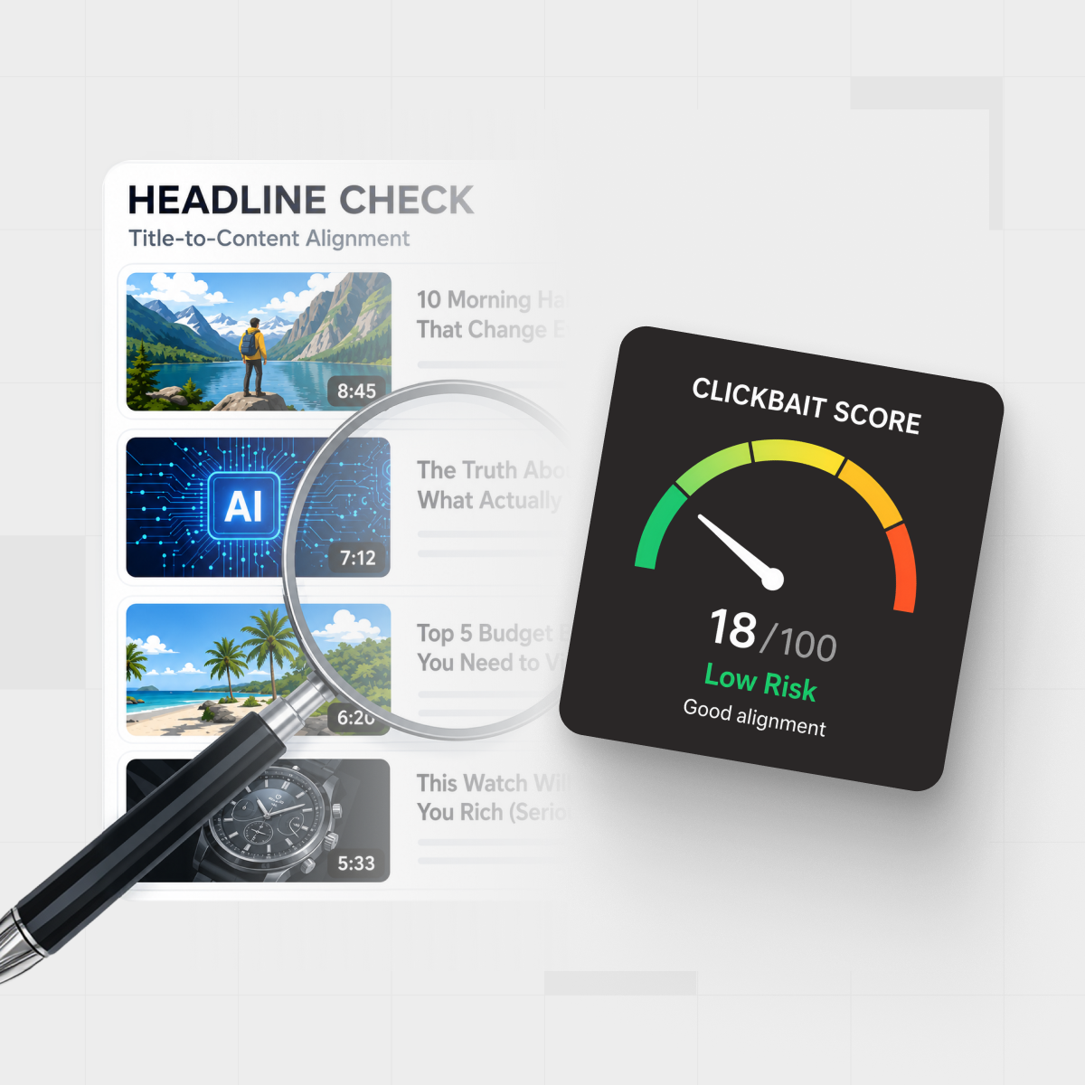
- Use IsThisClickbait to check whether your own titles, thumbnails, and videos really deliver on what they sell.
What is a clickbait website (and when does it actually help)?
On the worst days, “clickbait” means a flashy headline that stirs FOMO and a page that fails to deliver—a classic bait-and-switch.
The same ingredients can help when they’re honest: bold promises, sharp before/after contrasts, and specific numbers, supported by content that delivers real value above the fold.
From an SEO and UX angle, the real problem is mismatch between hook and substance. Misleading titles drive short sessions and lower trust; experiments on news headlines have found that clickbait-style phrasing can reduce perceived source credibility in at least one credibility study, and a Reuters-linked survey reported that many readers say clickbait headlines reduce trust in journalism.
That’s why tools like IsThisClickbait exist: they help you check whether titles, thumbnails, and YouTube content line up with the promise.
“The goal isn’t to be less interesting. The goal is to be as interesting as you can while still telling the truth.”
A simple framework for “good” clickbait headlines
Most high-performing headlines on landing pages share four ingredients. You’ll see these four show up again and again in the examples.

Map your clickbait-style headlines to clear layouts so curiosity, specificity, payoff, and proof all line up.
When your headline, subheadline, and layout work together, you almost always see some version of CSPP—Curiosity, Specificity, Payoff, Proof—in a row. You can even run drafts through an AI YouTube analyzer to see which levers you’re leaning on.
Now let’s look at 20 examples built on this backbone.
20 clickbait website examples that actually worked
These examples are based on real landing pages and tests from SaaS, newsletters, ecommerce, and course creators—lightly anonymized so you can copy the pattern, not someone’s brand copy.

Think of these 20 clickbait website examples as a gallery of reusable headline and layout patterns.
Headline changes alone can move real numbers. In one public A/B test, local news outlet 1Almere increased headline click-through by 11% just by making wording clearer and more specific in a simple headline test.
- “You’re losing users every time your app freezes” (SaaS error monitoring)
A hero with the warning headline, a signup form, and tiny crash-drop charts side by side makes the loss obvious and instantly shows the product as the fix. - “We watched 1,000 sales calls so you don’t have to” (call-review product)
A hero video thumbnail plus a carousel of real call snippets turns the “1,000 calls” claim into concrete proof and makes you curious about what they discovered. - “Stop writing ‘just checking in’ emails” (outreach assistant)
Split-screen screenshots of dull “just checking in” emails beside sharp rewrites shame a familiar habit and immediately show the upgrade your outreach gets. - “Your next 90 days of content, built in one afternoon” (content planner)
A simple three-step progress graphic and preview calendar compress “90 days of content” into one fast, visual workflow that feels doable in an afternoon. - “Fix the 3 leaks quietly killing your trial conversions” (SaaS optimization audit)
A checklist hero teasing three blurred “leaks” plus recognizable client logos combines mystery with authority and nudges you to scroll to reveal each fix. - “The ‘no buzzwords’ guide to AI for managers” (long-form article)
A clean article layout with a sticky outline and a “Key takeaway” box up top proves this AI guide will stay practical and buzzword-free. - “I tracked every minute of my work week. Here’s what shocked me.” (case-study post)
A big time-tracking chart and block-by-block breakdowns, capped with a TL;DR, promise a personal story plus data that quickly reveals the surprising pattern. - “The onboarding email that made people actually reply” (email teardown)
Side-by-side before-and-after onboarding emails with annotations scratch the curiosity itch and hand you a reply-generating template you can copy. - “What happened when we deleted half our product features” (product narrative)
A timeline of milestones and screenshots of the simplified UI turns the scary “deleted half our features” claim into a concrete, believable product story. - “Steal this roadmap template (we used it to ship on time)” (lead magnet)
A large template preview, short bullet list of what’s inside, and a tiny email form make “steal this roadmap” feel low-friction and immediately useful. - “The pillow people won’t shut up about in reviews” (ecommerce product page)
Star ratings and rave snippets stacked directly under the headline make the “people won’t shut up” claim feel earned, not gimmicky. - “This tiny keyboard shortcut saves designers hours” (tool for creatives)
A looping GIF of the shortcut in action plus a micro-demo video show, in seconds, how a tiny keystroke genuinely saves designers real time. - “The only skincare quiz that doesn’t recommend 12 products” (DTC brand)
A big “take the quiz” button above the fold with simple example routines beneath contrasts nicely with endless upsell quizzes and promises restraint. - “How I paid off my student loans without a 2nd job” (personal finance blog)
A personal narrative broken up with income/expense tables and a final checklist grounds the dramatic loan payoff in numbers you can follow. - “The checkout tweak that stopped people from bailing” (ecommerce CRO story)
Side-by-side checkout screenshots with callouts on one small change show exactly how a tiny tweak reduced cart abandonment. - “SQL in 30 coffee breaks” (micro-course page)
A progress meter (“Break 1 of 30”) and short lesson cards frame learning SQL as a series of coffee-length sprints instead of a huge course. - “The 5-slide pitch deck that finally got a yes” (founder resource)
A horizontal scroll of five slide previews with quick notes under each makes the “finally got a yes” deck easy to swipe and adapt. - “Turn your next lecture into a searchable cheat sheet” (student tool)
A mock side panel next to a real lecture video, showing live transcript search and highlights, instantly explains the student payoff. - “What your customers complain about when you’re not in the room” (research service)
A dense wall of anonymized quotes with topic filters immediately exposes uncomfortable feedback and proves the research depth. - “Before you buy any ‘productivity’ course, read this” (comparison guide)
A comparison table mapping common productivity-course promises to what they really mean turns a familiar “before you buy” hook into a protective buyer’s guide.
How to use these formats without crossing the line
Each of these formats can be used ethically or as a scam; the line is whether your promises are specific, true, and backed by visible proof.
- Keep the payoff visible. Promised checklists, templates, or teardowns should be obvious to quick skimmers.
- Put proof beside bold claims. Screenshots, testimonials, or data work best right under the hero, not buried.
- Match the tone of your audience. Cheeky hooks may fit startup founders more than banks or government services.
- Do the gut-check. If the headline sounds sleazy out loud, it’s probably over the line.
UX research on deceptive design patterns shows that bait-and-switch interfaces can win short-term clicks while eroding long-term engagement; headlines work the same way.
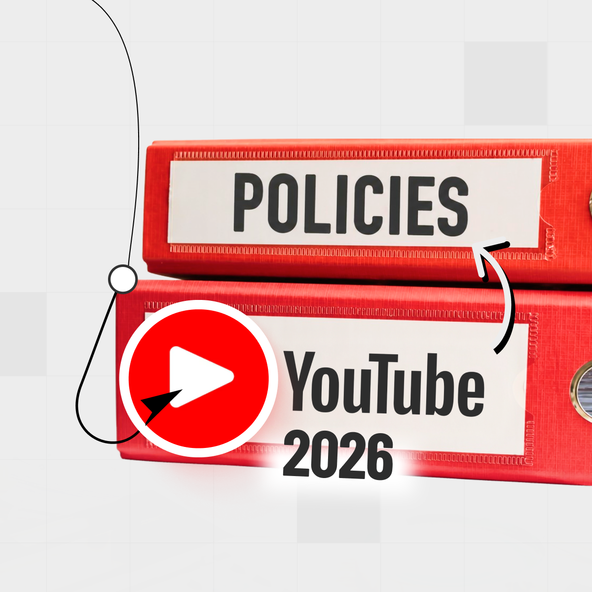
For more real-world hooks broken down, see our clickbait examples guide, and for YouTube-specific testing, read the YouTube title analyzer guide before running borderline ideas through IsThisClickbait.
Use IsThisClickbait to sanity-check your pages and videos
Headlines get written in brainstorming mode, which is great for ideas but not always for accuracy. Before you ship a new landing page or publish a video, run it through a second brain.

Pair bold headlines with data and tools like IsThisClickbait to be sure the promise matches the payoff.
Quick workflow:
- Draft your landing page hero or video title and thumbnail.
- Use the IsThisClickbait browser extension alongside YouTube to pull the transcript and summary.
- Compare what the title sells with what the content actually delivers.
- Tweak the headline until the clickbait score—and your own gut—say the promise and payoff really match.
You can also use the headline checker directly on key landing pages.
Install the browser extension for free, then pick a paid plan on the pricing page once you know how many videos or pages you want to analyze each month.
FAQ: clickbait website examples
Are clickbait website examples bad for SEO?
They’re bad for SEO when the page doesn’t deliver what the headline promises. Misleading titles tend to drive short visits and low engagement, and Google’s Search Essentials and Discover guidelines both warn against exaggerated or misleading previews.
How do I write a “clickbaity” headline without lying?
Start from the real outcome your product, article, or video delivers, then turn up the contrast between “before” and “after” with one specific detail like timeframe or audience. If you’d comfortably say the line to a friend, it’s probably fine.
Can I reuse these clickbait headline formulas for YouTube?
Yes. Many of the structures above work as YouTube titles, but make sure the title and thumbnail together don’t oversell what the video actually delivers, especially on emotional or money-related topics.
What’s the best way to test whether a clickbait-style headline actually works?
On websites, A/B or email split tests quickly show which headline wins on clicks and conversions. For videos, combine IsThisClickbait with YouTube’s analytics and the workflows in our title analyzer guide to compare click-through rate and watch time across different title and thumbnail combinations.
Where can I study more high-performing headlines?
Build a swipe file of pages and videos that made you click, and study why they worked. Sites like Copyblogger publish headline breakdowns, and you can run your own favorites through IsThisClickbait or a quick manual teardown to see why they worked.
Key takeaways
- Good clickbait is honest curiosity with a clear payoff. Use strong hooks only when the page or video genuinely delivers.
- Run the CSPP checklist. Make sure your hero combines Curiosity, Specificity, Payoff, and Proof in one tight package.
- Pair headlines with proof and layout. Put testimonials, data, or visuals right beside your boldest promises.
Sanity-check with IsThisClickbait. Run important pages and YouTube videos through the tool to confirm the title, thumbnail, and content really match.